On the last Tuesday of every month, I feature a fellow type lover from the Richmond, VA area.
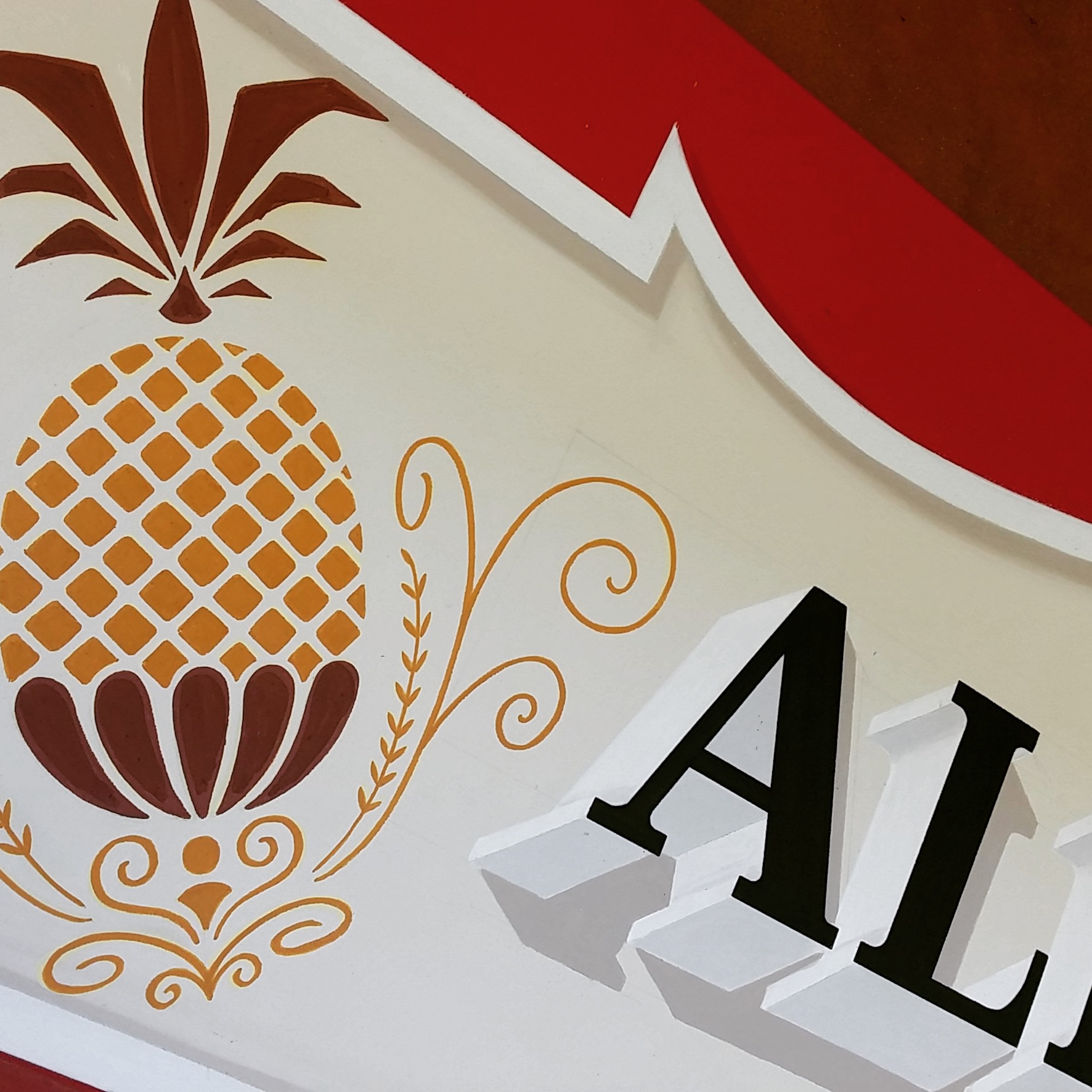
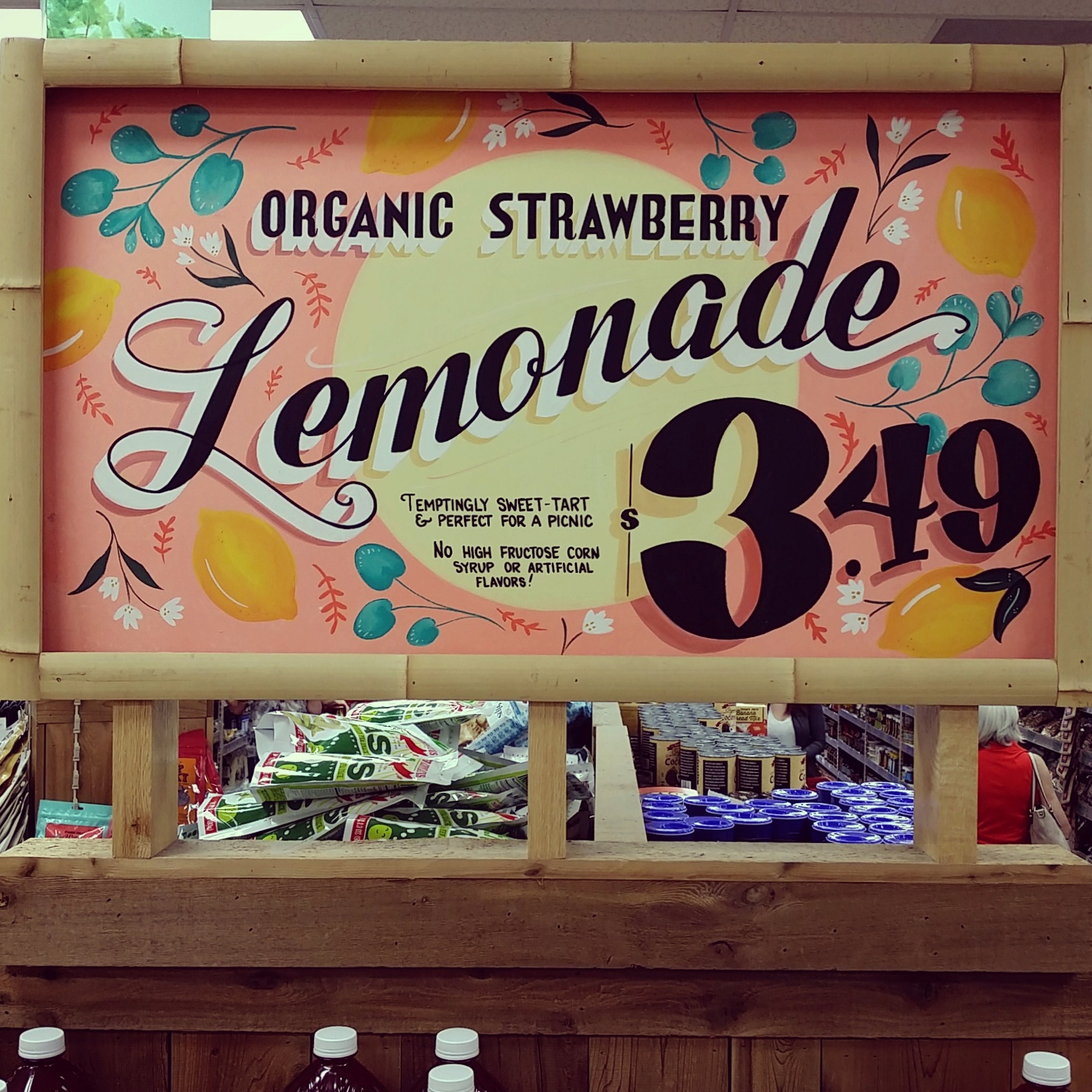
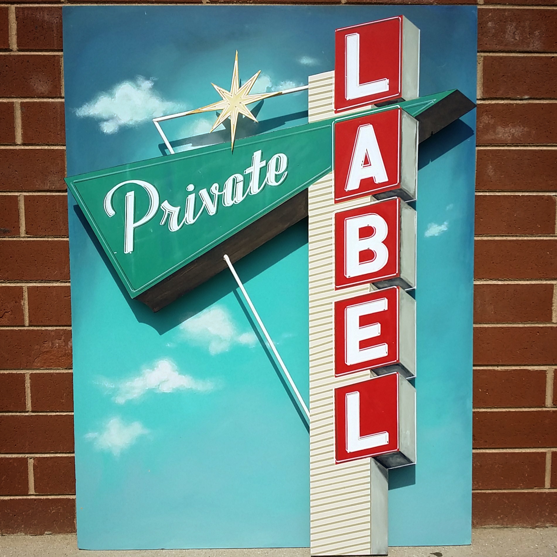
You may have admired Rachel Humiston's beautiful signs on the end caps at the local Trader Joe's here in Richmond. Read on to find out more about how this gig at a grocery store helped her develop her sign painting skills.
SARAH BARTON: I saw that you studied math at Randolph-Macon College. How did you get into lettering?
RACHEL HUMISTON: After I graduated college I realized that I wasn't interested in teaching math. I wanted a job in a creative field, but I lacked the resume experience. I saw a post on Craigslist for a Trader Joe's sign artist position and I leapt at the chance. In the beginning I was still so math-oriented I was doing algebra to figure out the spacing of the letters. I learned as I went and I completely fell in love with the medium.
SB: The majority of your pieces are large, hand-painted signs. What do you like most about working at that size?
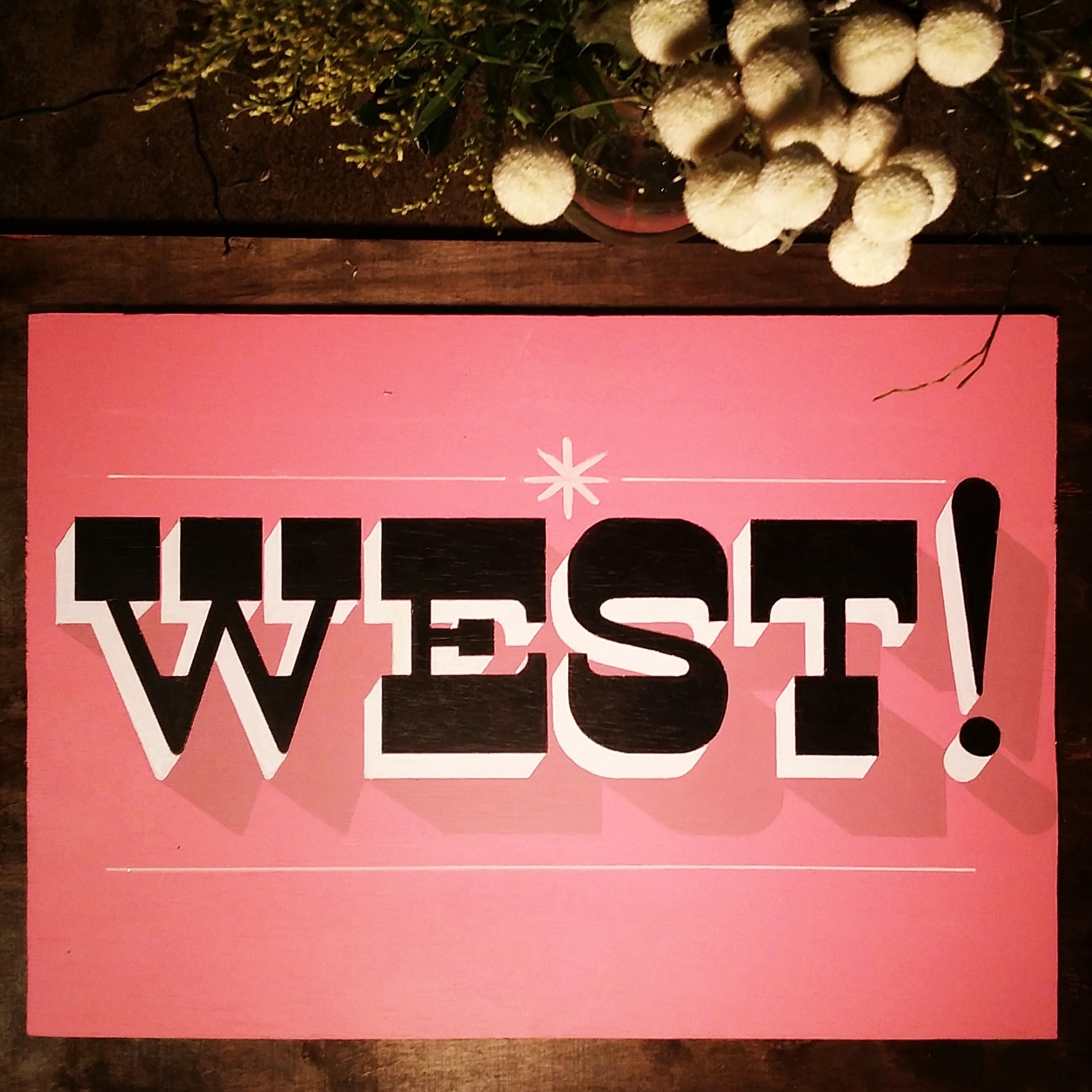
RH: Most of the boards are between 4 and 6 feet long and 2 feet high. It's the perfect size: large enough to accommodate the info, but small enough to manipulate the position and angle to get those clean lines.
SB: I noticed you often incorporate illustration with your lettering as well. Was that also something you learned along the way or have you always liked illustrating?
RH: As my work evolved, there came a time when what I envisioned required an illustration and I didn't feel confident in my drawing skills. For a while, I would come up with a different design that didn't involve imagery, but eventually I didn't want my vision to be limited by my skill set. I made myself push through the less-than-ideal drawings so I could grow, and with time, I started to see improvement. I still have a long way to go, but the challenge keeps things interesting.
SB: After almost 8 years of making signs for Trader Joe's, how do you continue to come up with fresh designs for them?
RH: The expectation at Trader Joe's is that the signs are function first — the aesthetics are a distant second. Since there is no external pressure to be fresh, the desire to push the envelope can come from an authentic place. Sometimes the best results come from revisiting the same project; it can help you see your progress and that motivates me to keep trying new things.
SB: You letter for your day job in addition to taking on freelance lettering commissions. How do you keep from getting burnt out?
RH: My work for Trader Joe's and my freelance projects have different constraints and challenges. That creates a certain degree of separation which prevents the redundancy that causes burn out. There is a rapport that exists between my work inside and outside of Trader Joe's. Because the majority of the signs are temporary, Trader Joe's allows me to experiment in a low-key environment with clear expectations and that balances out the perfectionism I feel when freelancing.
SB: Can you walk us through your creative process step-by-step?
RH: For any project, I start by surveying my source material (i.e. packaging or logo) for anything that jumps out at me; it could be a font, a color, or even a time period-inspired styling. I take the strongest design elements and build from there. Then I do a little research on Pinterest or in my favorite books to flesh out the idea and create a very loose sketch. After I'm satisfied with the sketch and I can visualize the end result, I chalk the layout directly onto the board. The chalk is easy to erase so I can adjust the design and move any elements thats aren't working. Next, I pencil in the lettering more precisely to create my outlines and finally it's time to paint!
SB: How long does a project generally take you from start to finish?
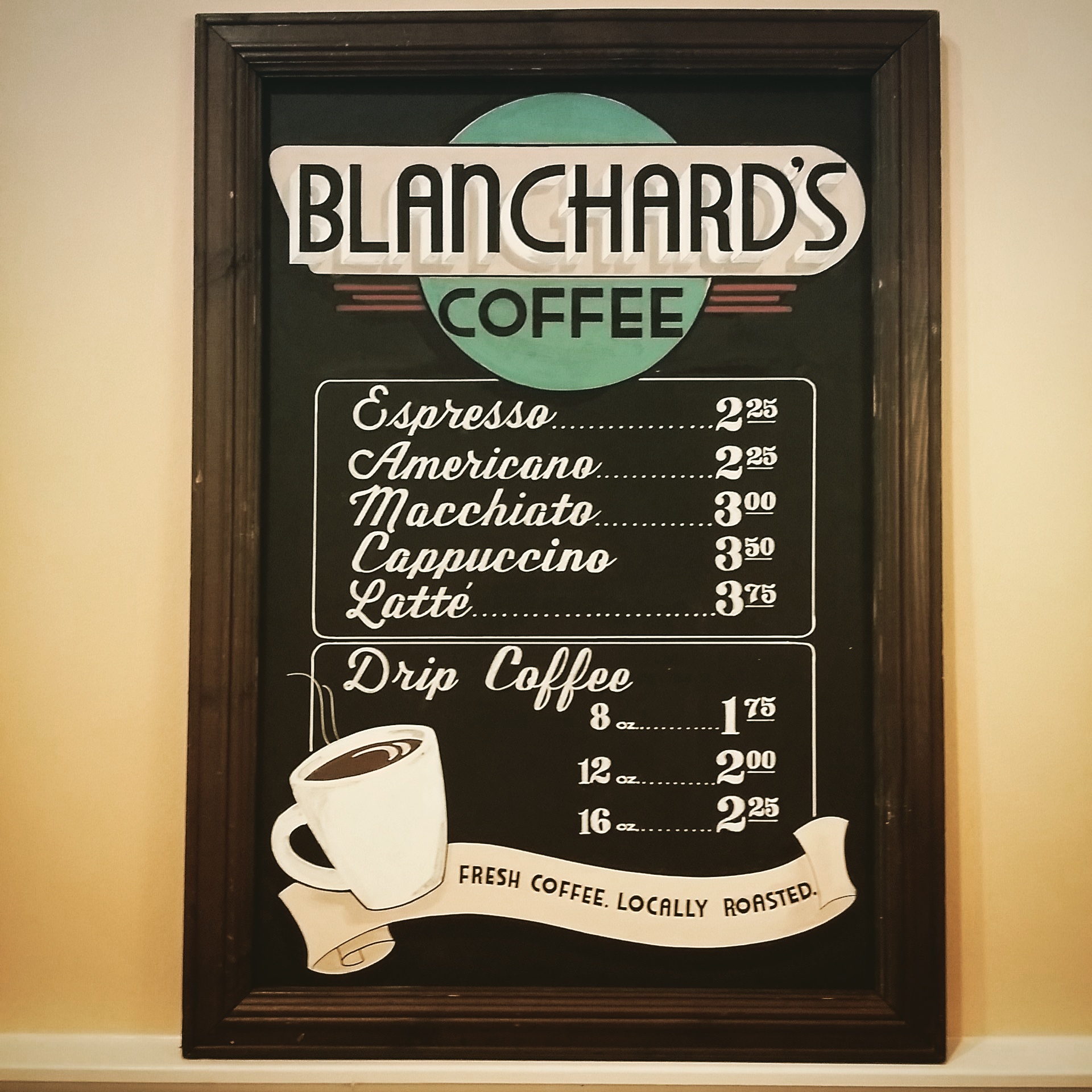
RH: It's hard to get a clear read on how long a project takes because I so rarely do a single project at a time. I usually work on at least 2 boards simultaneously to avoid downtime waiting for paint to dry. If I had to guess, I would estimate a large display sign takes 4-6 hours. Menus and more elaborate projects can take much longer.
[CLICK IMAGES TO ENLARGE.]
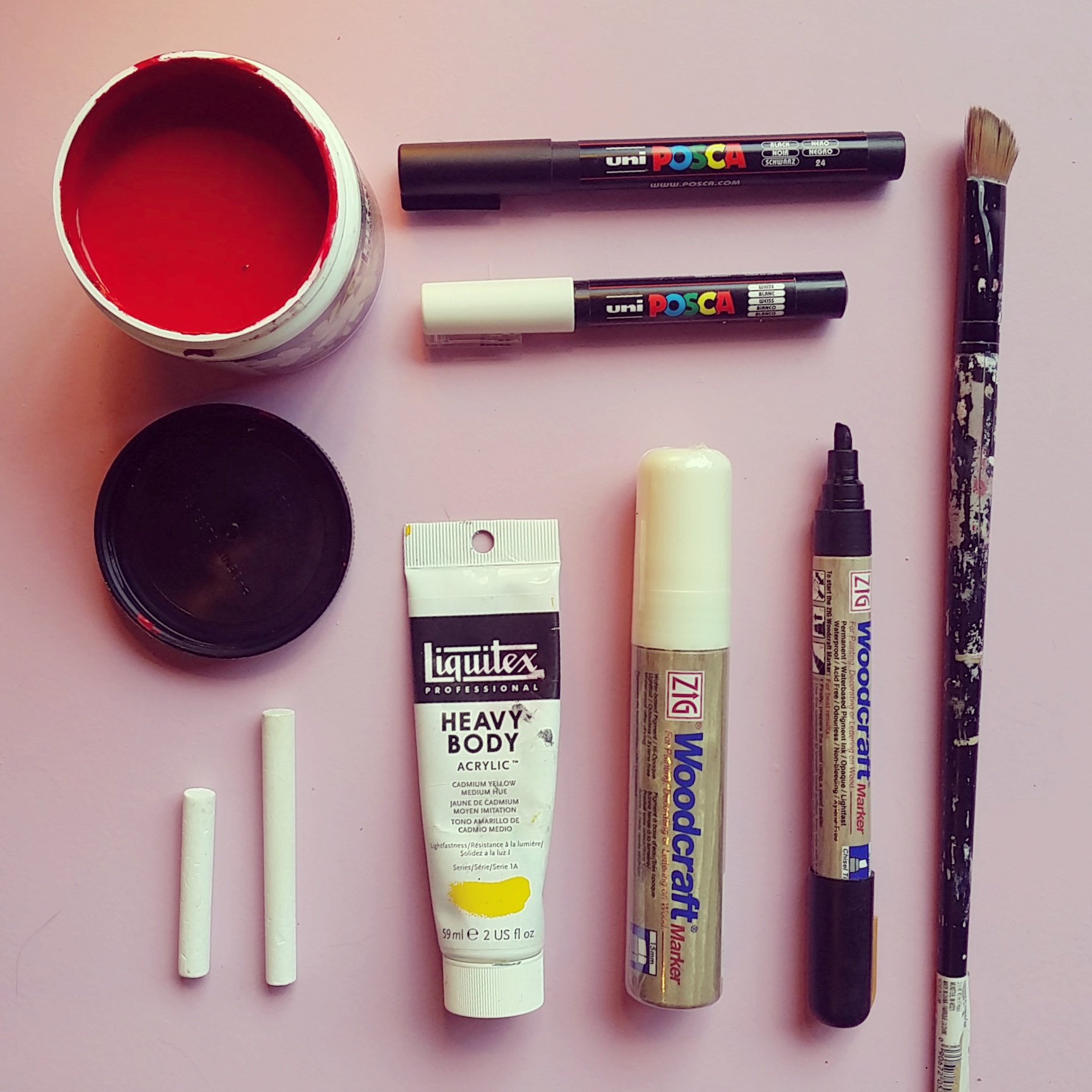
SB: Do you have any favorite tools (brushes, paints, etc.)?
RH: Woodcraft markers are my number one staple for everything I do. They are highly pigmented and incredibly versatile; I've used them on mirrors, chalkboards, walls, paper, you name it! I absolutely adore them. They look great on their own, but if I have a specific color palette in mind that isn't covered in their line, it is very simple to draw what I need with the marker and then paint over it with acrylic or latex paint. I'm also a huge fan of Behr house paint; the coverage is great and it is easily accessible at a great price, perfect for both large backgrounds and small details.
SB: You've participated in RVA Makerfest for the past two years. What are some tips for anyone interested in having their own booth at a show?
RH: I learned so much in the process. In terms of tips: make eye contact and greet people so they feel comfortable approaching; if you can do a live demo you definitely should, people love seeing how things are created, and it is a great conversation starter; bring more business cards than you think you need!
SB: Where do you get inspiration for your work? What are some of your "best-kept secrets" (websites, books, tips, etc.)?
RH: Pinterest is great for finding new fonts. I use Instagram to find inspiring artists; @tjguzzardi and @signsofpower, from Australia and Ireland respectively, are two of my favorites. Their use of color, shadow and clean lines are hugely inspirational and drive me to perfect my craft. I also check out #signpainting on Instagram daily to see what's new. I have a whole library of books but I always find myself revisiting Rian Hughes Custom Lettering of the 40's and 50's. It has thousands of samples of vintage lettering and it is really helpful if I'm looking for ways to combine fonts or layouts with multiple lines of text. My favorite tip is to draw from the shoulder, not the wrist. Using the larger muscle groups definitely helps with stability.
SB: What do you love most about being a creative in Richmond, Virginia?
RH: I feel like Richmond is the perfect size for a creative just starting out in their career. It's big enough to be loaded with possibilities, opportunities and aspirations, but small enough to allow access. You can have face-to-face conversations and connect with the community more easily than in other cities. Richmond is so alive and growing that there is definitely room for you to find your place, which is very encouraging.
SB: What can we look forward to seeing from you in the next few months?
RH: In July I will be teaching a workshop called Hand Lettering on Found Objects at the Visual Arts Center. It will be a fun chance to try your hand at lettering and I am really looking forward to sharing tricks I've learned over the years.
Keep up with Rachel on Instagram @signjay.


